CarWars
the branding features a bold and tech-savvy look that reflects the professional nature of the SaaS platform for car sales. The visual identity incorporates sleek, modern design elements that convey speed, efficiency, and cutting-edge technology.
Services:
Re-branding & Strategy
UI-UX,
Tradeshow Assets


Old Branding/ Website
Aim: To get people to schedule a call & take demo
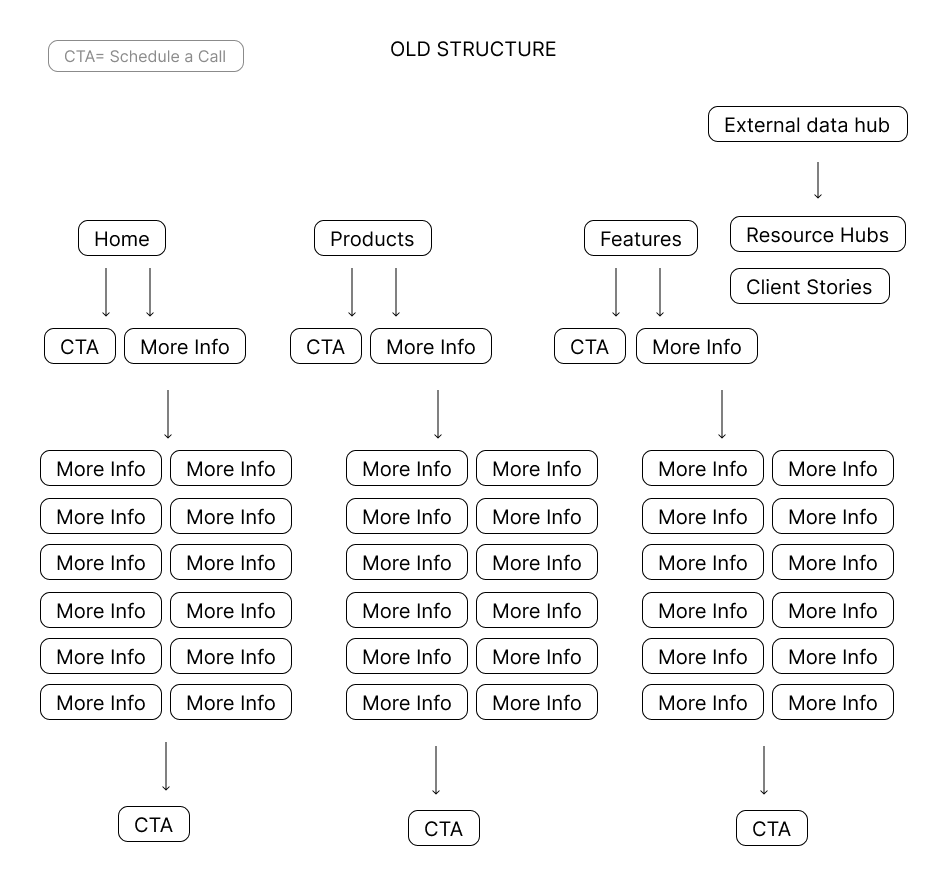
Problems (a basic structure for reference below, with comparison to the new website structure)
Information overload, there were more than 45 pages on the website excluding the external data hubs like resource pages & client stories.
Redundant & repeated infromation Each feature/ product offering had its own page.
The extreme contrast & saturated visuals make it more congested lacked professionalism
CTA’s were lost in so much information.
Multiple CTA’s leading to more information & Less conversions to actual demo
New Branding/ Website
Aim: To get people to schedule a call & take demo
Solution (a basic structure for reference below, with comparison to the new website structure)
Flatter structure with limited pages
Promoted people to schedule a call to get “more information“ rather than overloading the customers with it.
New UI made it easier & more pleasing on the eye to navigate
Multiple CTA leading to take a demo across a page
Higher Conversion Rate


Old Branding


