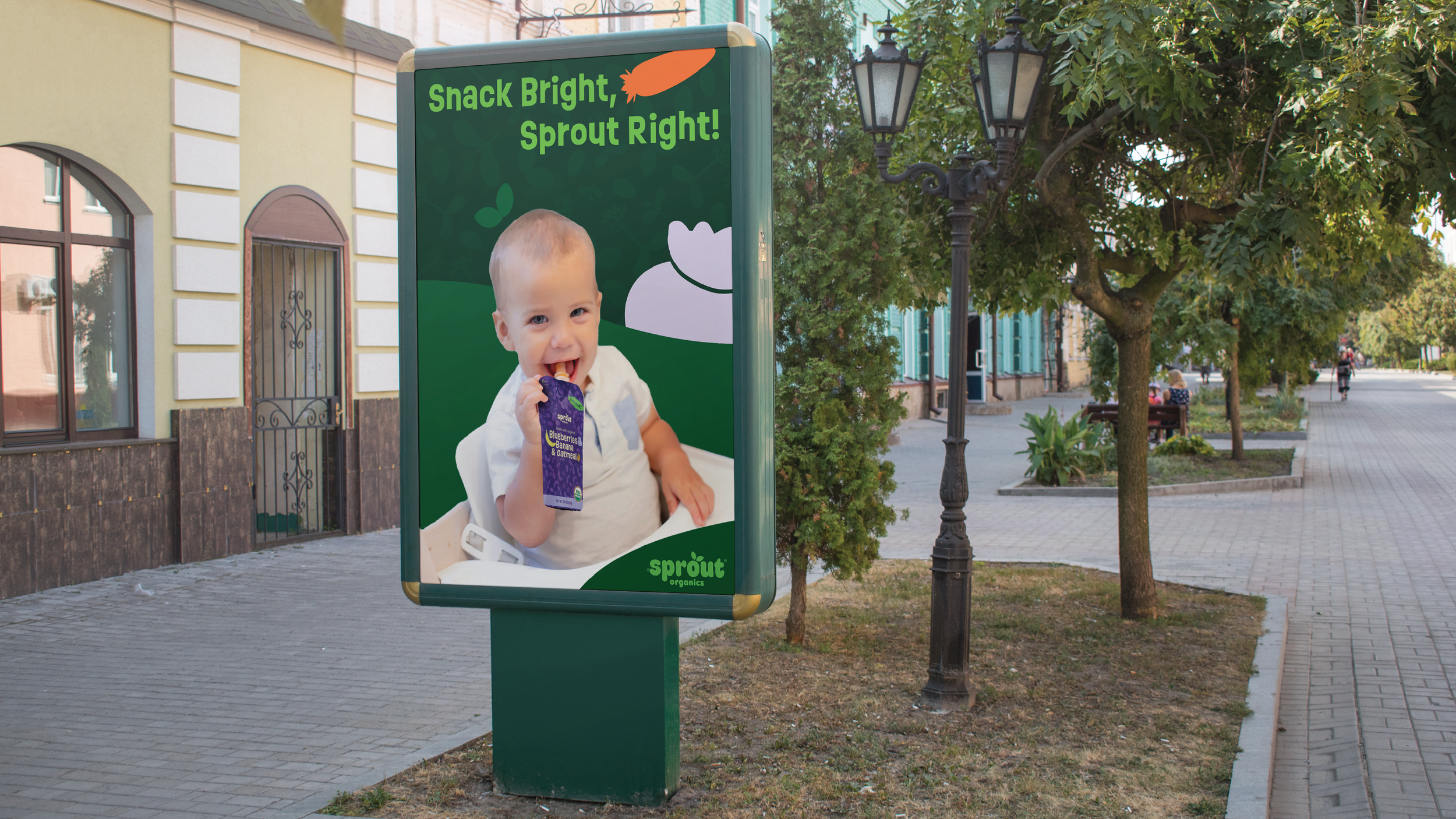
Sprout Organic
Rebranding Concept for a baby food company. This Bright & Sprouty is a lively, fun concept with an emphasis on growth and vitality, represented by the sprout motif throughout the design. The brand uses bright, energetic elements balanced by a neutral palette to create a fresh, inviting aesthetic. The sprout symbolizes new beginnings and growth, making it central to the brand’s identity, visually connecting the concept to themes of vitality, health, and freshness.
Scope:
Branding & Strategy
Packaging