carwars

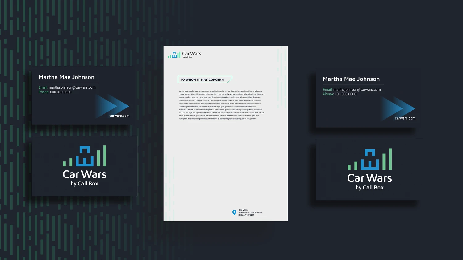
A complete visual identity and web system for a B2B SaaS platform.

Role: Design Lead for this project at Clutch Creative

Role: Design Lead for this project at Clutch Creative

§ 01 — THE INSIGHT

The site was trying to sell through information. It should have been trying to start a conversation.

The site was trying to sell through information. It should have been trying to start a conversation.

The site was trying to sell through information. It should have been trying to start a conversation.

The job of the page wasn’t to explain everything — it was to earn one click: “Get a demo.” Every decision that follows comes from that single reframe.

01

Information overload

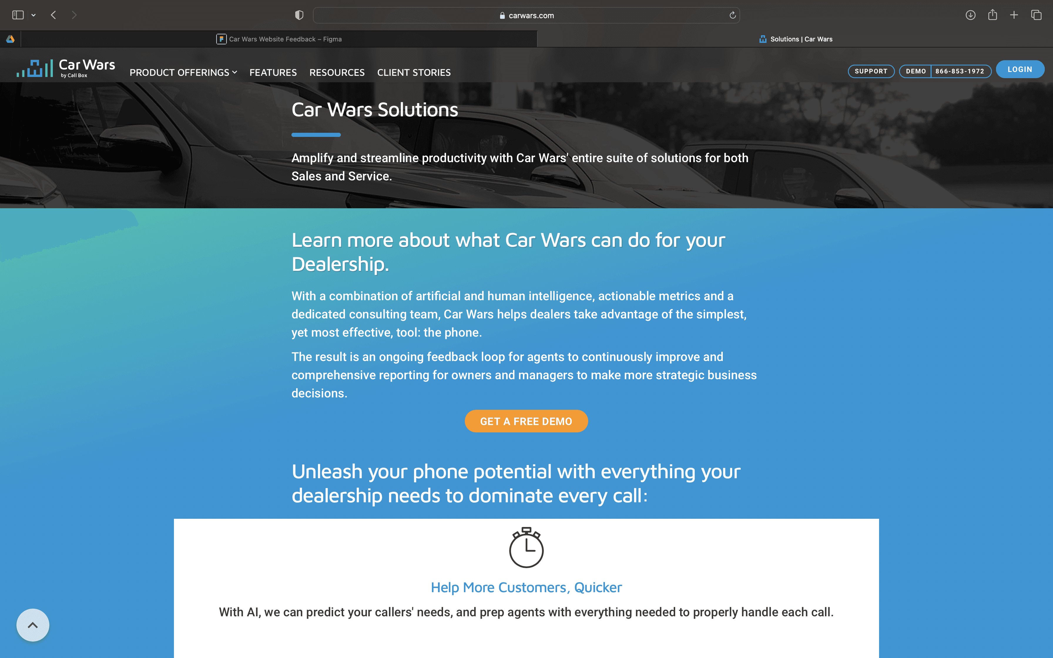
45+ pages before counting resource hubs and client stories.

02

Redundancy

Every feature and product had its own near-identical page.

03

Visual noise

Extreme contrast & saturation read as congested — undercutting professionalism.

04

Buried CTAs

The primary action drowned in surrounding content.

05

Diffused intent

Too many CTAs led to more info instead of a demo — conversions leaked.

GOALS & SUCCESS METRICS

One clear job per page.

One clear job per page.

One clear job per page.

G1

Reduce the IA from 45+ pages to a focused, flat set.

G2

Make “Get a demo” the unmistakable primary action on every page.

G3

Rebuild the brand to read as credible, modern, enterprise-ready.

G4

Replace push (here’s everything) with pull (talk to us for more).

PRIMARY KPI

Demo bookings & conversion rate

Secondary signals:

bounce_rate ↓ · time_to_first_cta ↓ · demo_form_completion ↑

REDESIGNED EXPERIENCE

From sprawl to a single funnel.

From sprawl to a single funnel.

From sprawl to a single funnel.

The old site scattered attention across dense resource hubs, near-identical feature grids, and competing calls to action — schematized below.

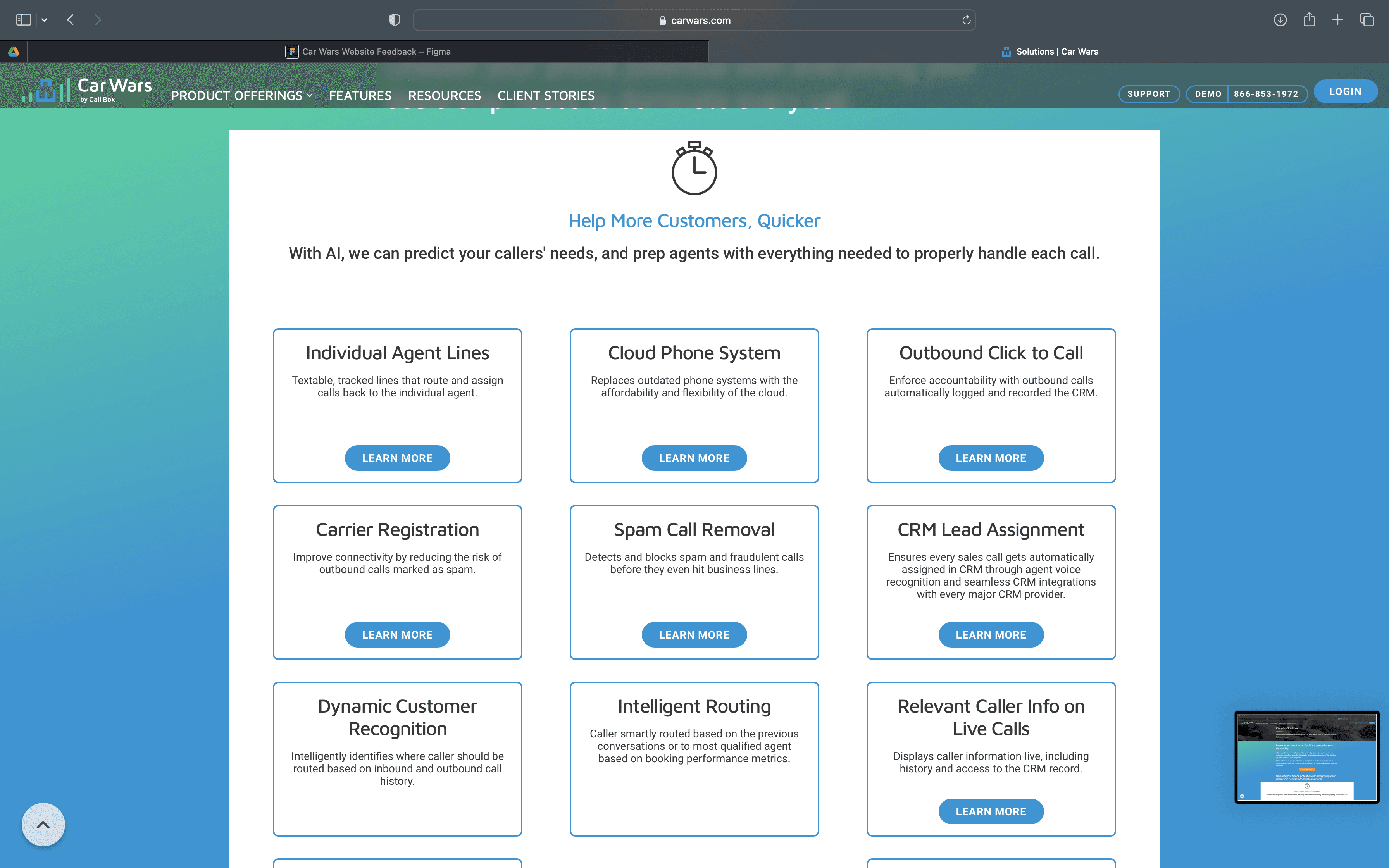
carwars.com/resources

OLD

CTA

CTA

Calculator

Quiz

Blog

Resources hub — 8 categories, zero hierarchy

USER PERSONA

Built for the person who has 30 seconds.

Built for the person who has 30 seconds.

SP

Sales Person

time-poor

evaluating between calls

numbers-driven

THEIR PROBLEM ON THE OLD SITE

“I can\’t tell what the core product is or who to talk to — there are twelve pages and five buttons.”

WHAT THEY NEED IN 30 SECONDS

What it does for their numbers, proof it works at real dealerships, and one obvious next step.

JOB TO BE DONE

Quickly judge whether this is worth a demo — then make booking it effortless.

INFORMATION ARCHITECTURE

From sprawl to a single funnel.

From sprawl to a single funnel.

The old tree scattered intent across dozens of pages and competing buttons. The new one flattens everything and points every path at one action.

BEFORE · 45+ PAGES · INTENT LEAKS

Home many CTAs

Feature 1

Feature 2

Feature 3

Feature 4

…40+ more

“More info” — not a demo

AFTER · FLAT · ONE ACTION

Home one clear CTA

Product

Solutions

Proof

Get a demo

Old / leaking

New / focused

The conversion action

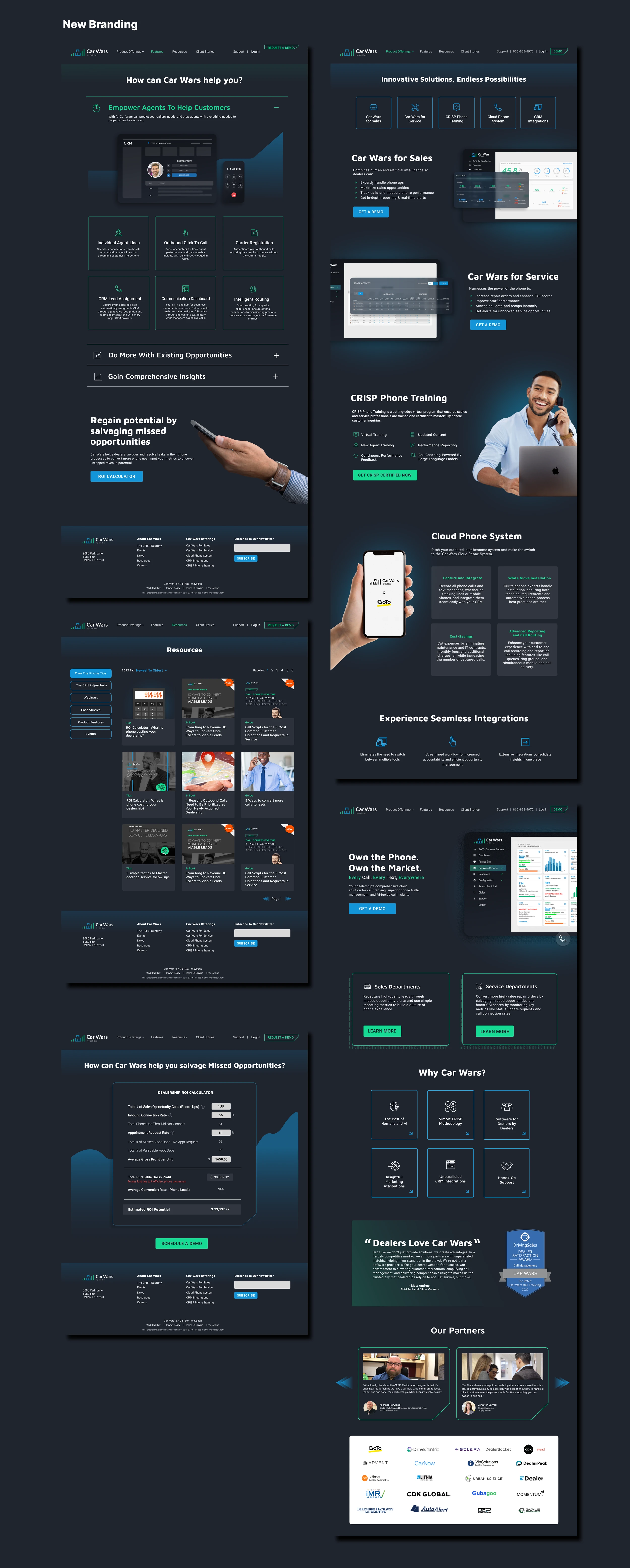
New Website & Branding

We built a retro-leaning yet modern identity centered on warmth, approachability, and the tagline “Whole Lotta Love.” A limited color palette lets the food stay the hero, while a playful mascot family (the “Big Dill” crew in signature sunglasses) gives the brand a memorable face that works at every scale.

We built a retro-leaning yet modern identity centered on warmth, approachability, and the tagline “Whole Lotta Love.” A limited color palette lets the food stay the hero, while a playful mascot family (the “Big Dill” crew in signature sunglasses) gives the brand a memorable face that works at every scale.